Project managers gather, track and report different types of data. Microsoft programs such as Excel and PowerPoint are used often but there are several other tools to view and interact with data. I’ve recently come across these tools and have started exploring them further such as Observable. Observable has free and paid options if you need collaborate with team members. Some of these tools utilize JavaScript and are designed to be published on a website.
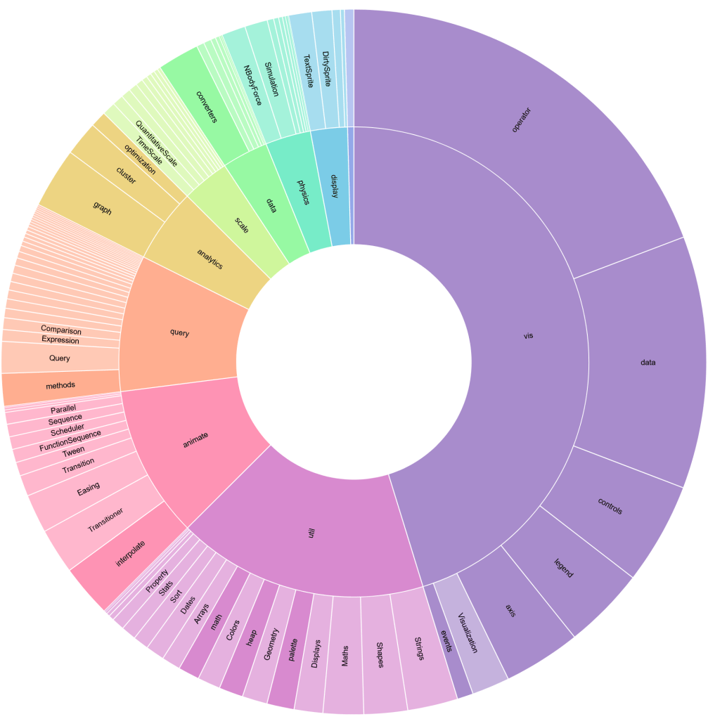
Visualizing data can help a project manager or project team gain critical insights that would otherwise be overlooked. Another advantage is visualization tools can simplify reams of data in a single image. Previously, the same amount of information was scattered in different media such as pie and bar charts. For example, the Radial Tidy Tree below show hierarchies via nodes. Below the tree is a sunburst that is collapsible.

Other companies that offer data visualization and charting tools:
- HighCharts
- Vega-Lite
- Add-Ins.com: This company has a few packages that integrate with Excel to easily create Bubble Charts, Histograms, and Mekko Charts.
Leave a comment to recommend visualization tools and their applications.
